TL;DR
We designed and tested four immersive VR security warnings (see them below!) for third‑party malicious app (e.g. a coffee mug); a red object glow consistently outperformed pop‑ups and other immersive warnings for drawing attention and preventing risky actions.
Model: Coffee on Sketchfab (attribution required).
Why This Matters
On the web, you know the drill: red browser screens, lock icons, “Are you sure you want to continue?” warnings. But VR isn’t the web.
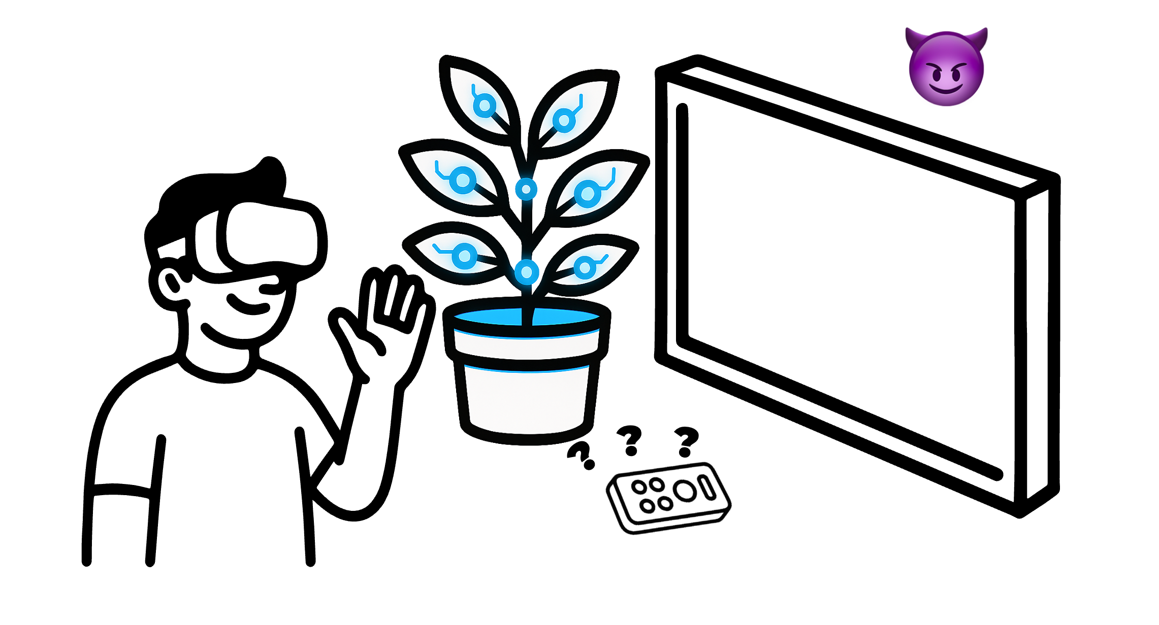
Inside a headset, you’re surrounded by apps and objects that can all live in the same scene. A Netflix screen floating on your wall might sit next to a plant, a lamp, and—oh—maybe a malicious app disguised as a sticky note.
Traditional 2D security cues don’t cut it here. So we asked:
👉 What does a good VR warning actually look like?
From Literature to Designs
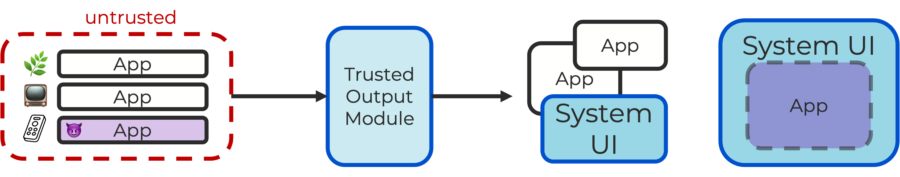
We built our work on the idea of a trusted output module—a "system" module that can always overlay system-level UI (in our case, warnings), no matter what apps are running. We built our warning concepts through two surveys:
- VR Interaction Survey: screened 9,896 VR/HCI papers and 20 top consumer VR apps, identifying 17 common input and output modalities.
- Security Warning Survey: reviewed 99 papers from leading security and HCI venues, distilling 10 design recommendations (e.g., distinct style, task friction, scene integration).
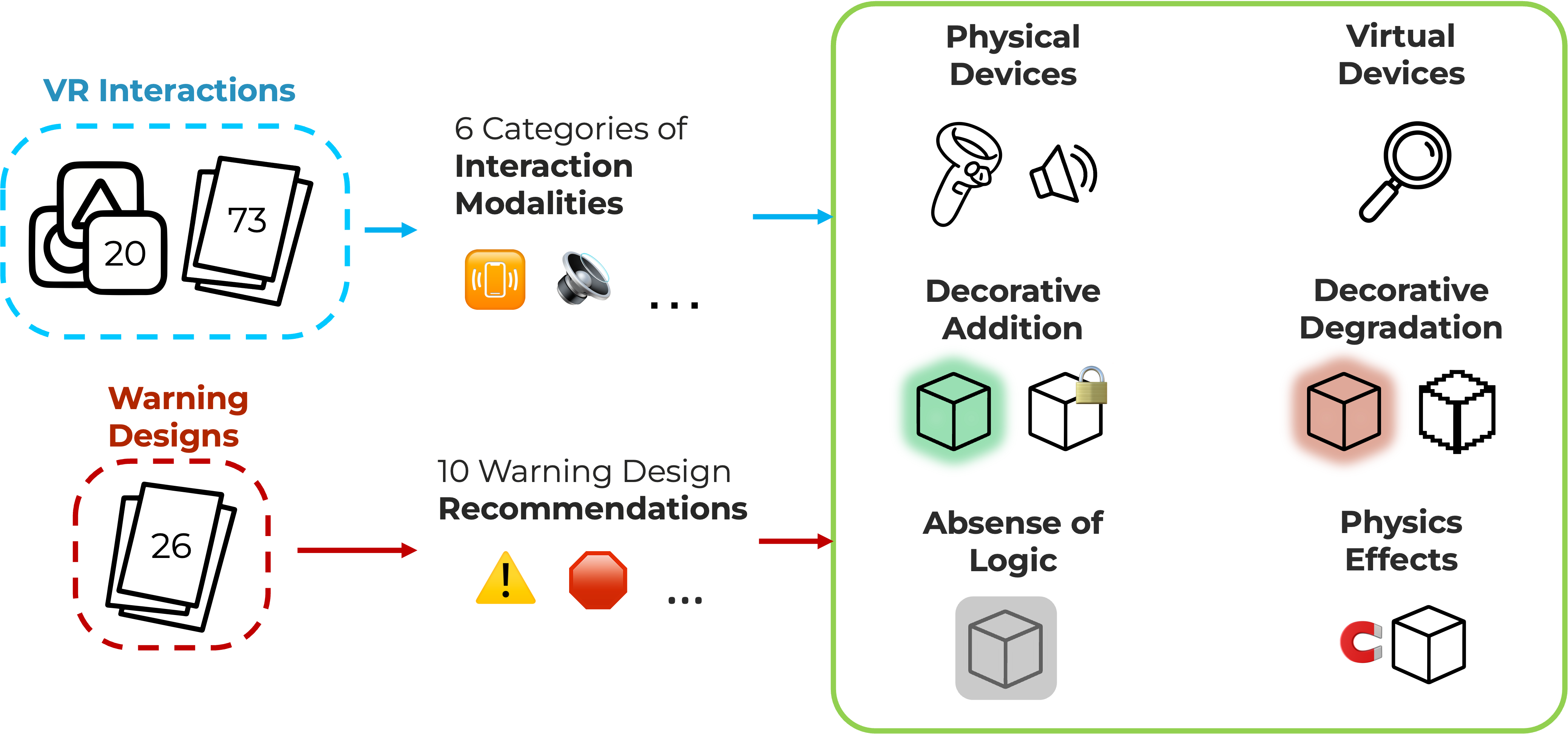 Filtering out designs that were hardware-specific or easy to spoof, we selected four warnings:
- Red Glow – insecure objects surrounded by a red aura.
- Blur – objects blurred to reduce attractiveness.
- Pop-Up – explicit confirmation window before interaction.
- Scale Down – objects shrink when touched, creating urgency.

User Studies
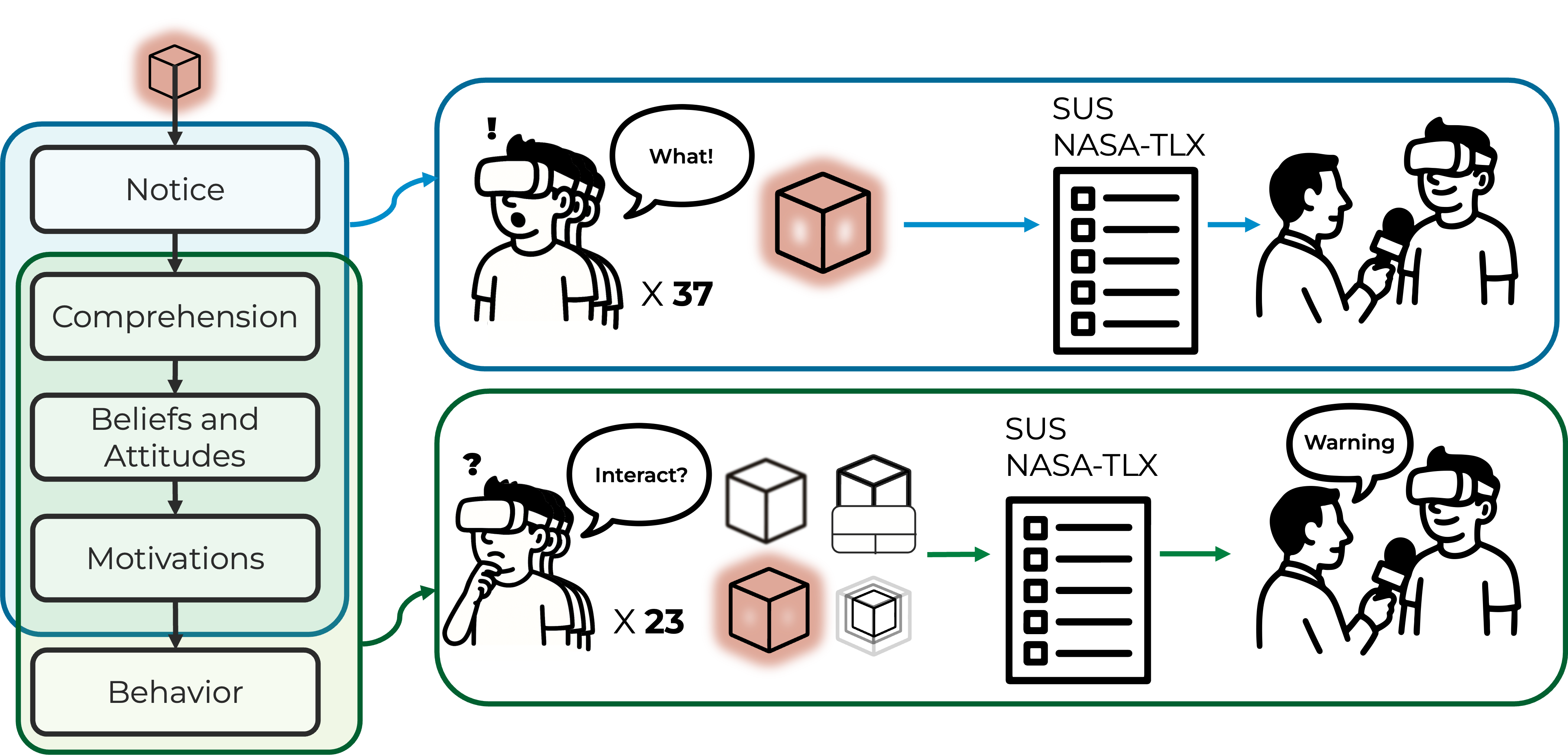
We evaluated the warnings using the C-HIP model (Communication–Human Information Processing), which examines how users notice, understand, and act on warnings.
- Study 1: Participants interacted freely with objects while warnings were active, followed by questionnaires and interviews.
- Study 2: Participants knew that some objects could be insecure and compared all four warnings across usability, workload, and security.
What We Found
- Red Glow: most effective, strongly linked to danger; occasionally mistaken for a “selection highlight.”
- Blur: noticeable and discouraged interaction, but often seen as a visual glitch rather than a warning.
- Pop-Up: easily ignored, failed to motivate secure behavior.
- Scale Down: created urgency, but sometimes encouraged rushed risky interaction.